
DCN

Online Booking & Request an appointment form
UX/UI Design

UX Strategy
Product thinking
Customer Experience
Interaction design
Design System

Project Overview

The goal of the Dental Care Network project was to enhance the online booking experience for dental patients by integrating an intuitive, efficient appointment system into the DCN platform. This initiative aimed to unify fragmented third-party booking flows into a seamless, internal solution that better aligned with patient expectations and operational workflows across Bupa Dental clinics.

Problem Statement

Bupa Dental required a cost-effective, rapidly deployable booking system to reduce dependency on third-party platforms and streamline access to services across devices. The solution had to support both online and phone-based bookings, accommodate complex internal scheduling needs, and be mobile-first all within a tight timeline and limited budget. Additionally, it needed to serve a diverse user base, including parents booking on behalf of dependents.

Project Duration

My role

Phase 1 - UX/UI Design & Form Implementation

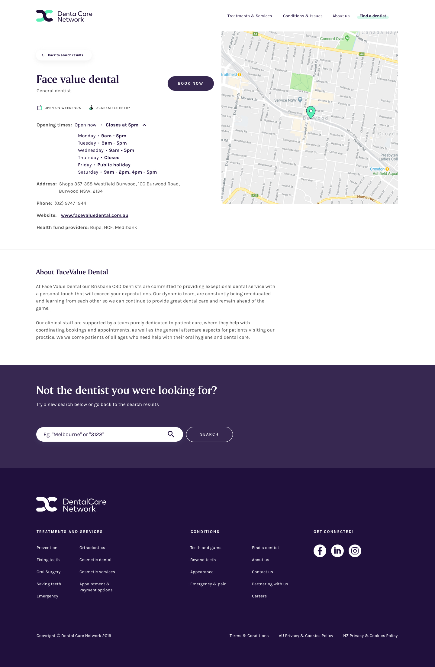
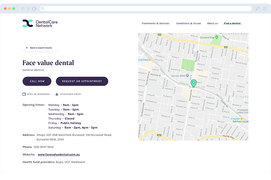
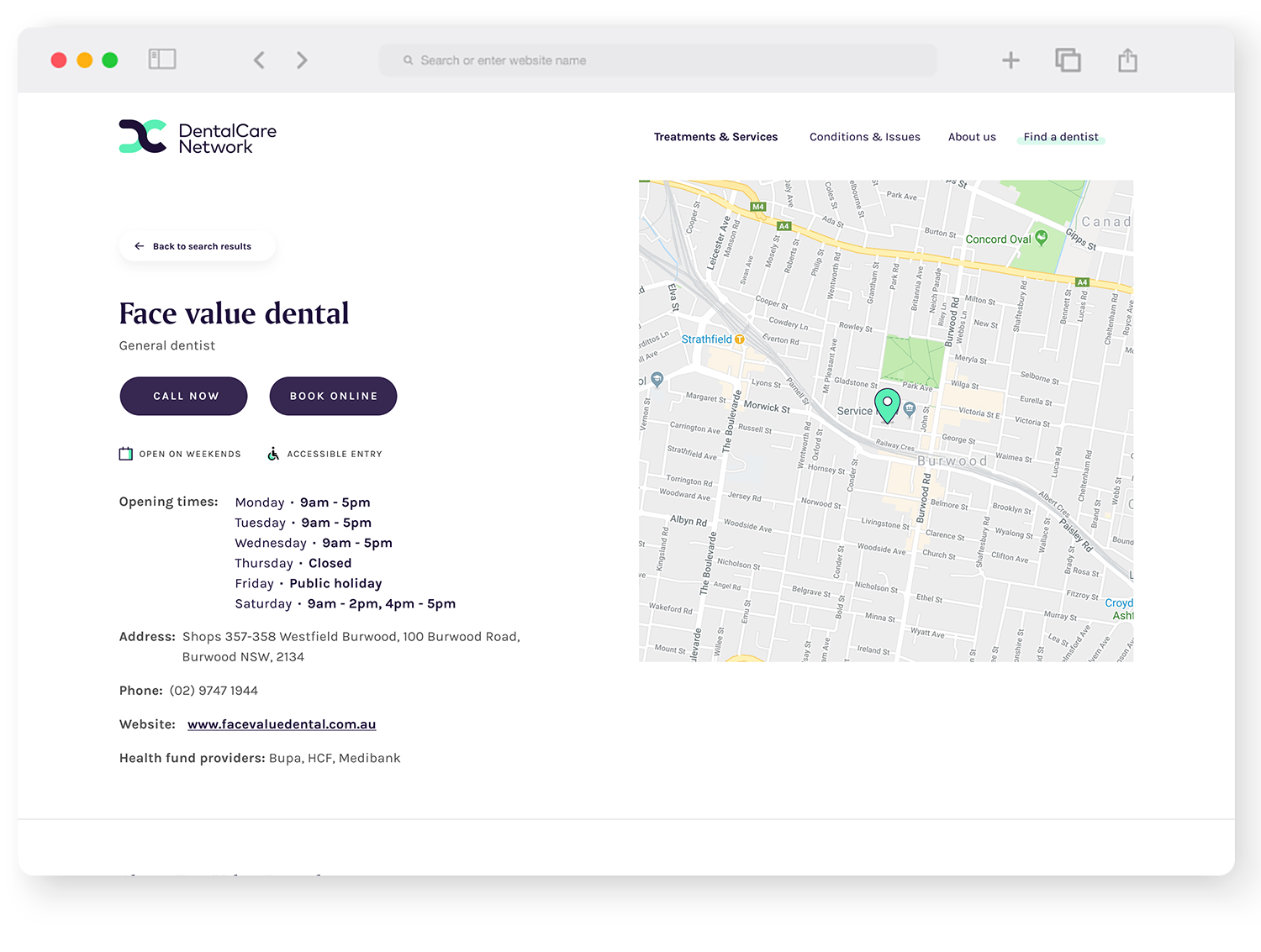
DCN | Practice Detail Page UX Journey

Initially, the UX development only required two calls to action:

  • Book now or 
  • Call now

UX Challange

User did not have flawless experience in the page as there are only one CTA options available in the website and the booking is done through the external website.

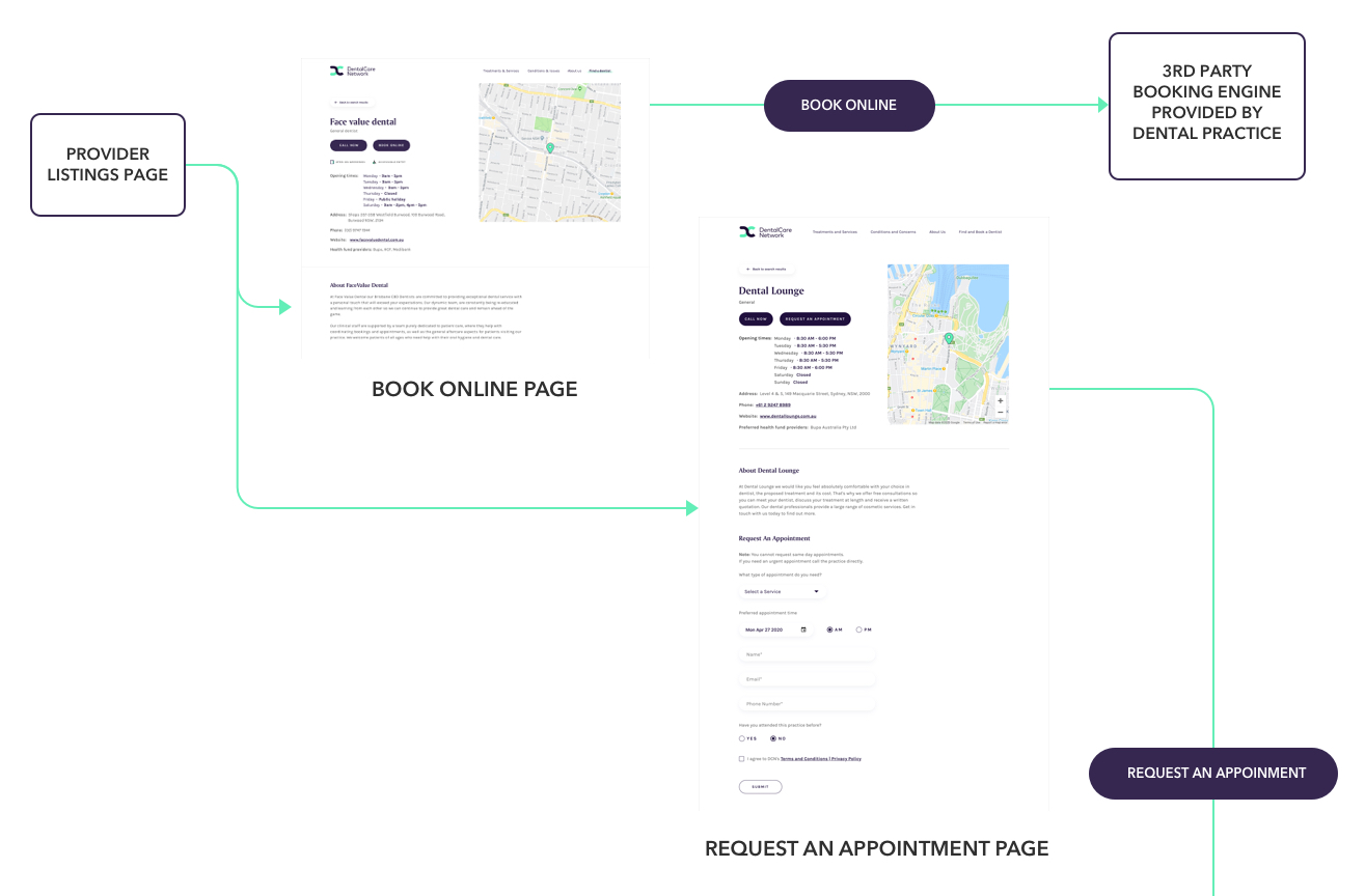
During this phase of development, stakeholders required the inclusion of two CTAs on the website. 

  1. The first CTA would be either ‘Book Now‘ (for practices with an internal booking system) 
  2. or ‘Request an Appointment‘ (for practices without one, serving as a direct contact point between patients and the clinic). 
  3. The second CTA, ‘Call Now,’ remained consistent across all sites
We believe offering these options to patients will reduce friction in the user experience, improve engagement, and enhance overall efficiency on the DCN website.

Discovery & Planning

  • Stakeholder interviews (Product Owner, Delivery Manager, Developers, QA).

  • Competitive analysis across AU, UK, US dental platforms.

  • Defined key user personas (parents, returning patients, new visitors).

Collaborating with the team to create high level IA

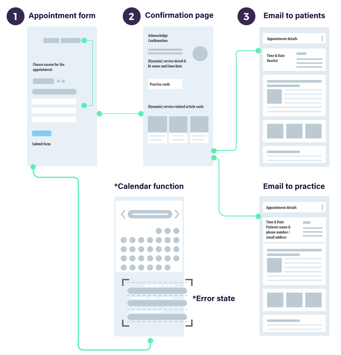
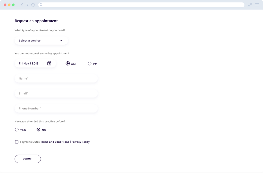
Appointment form requirements

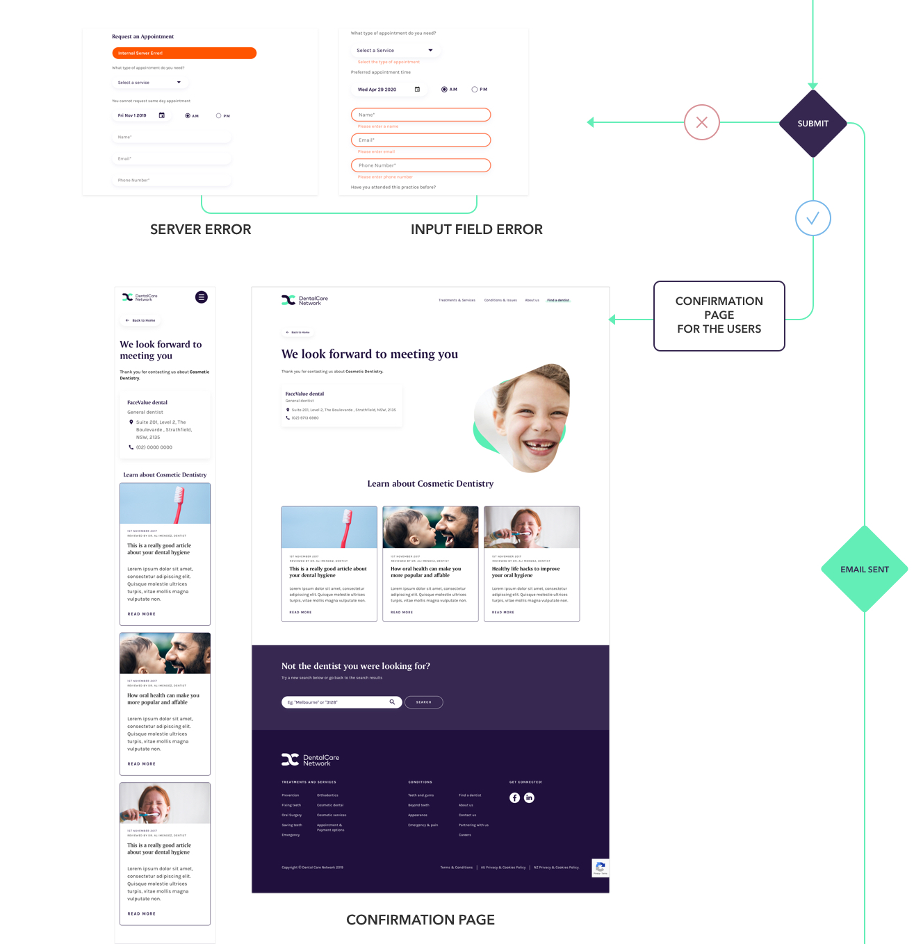
  • Form, including validation
  • Drop down menu
  • Date picker
  • Confirmation pages
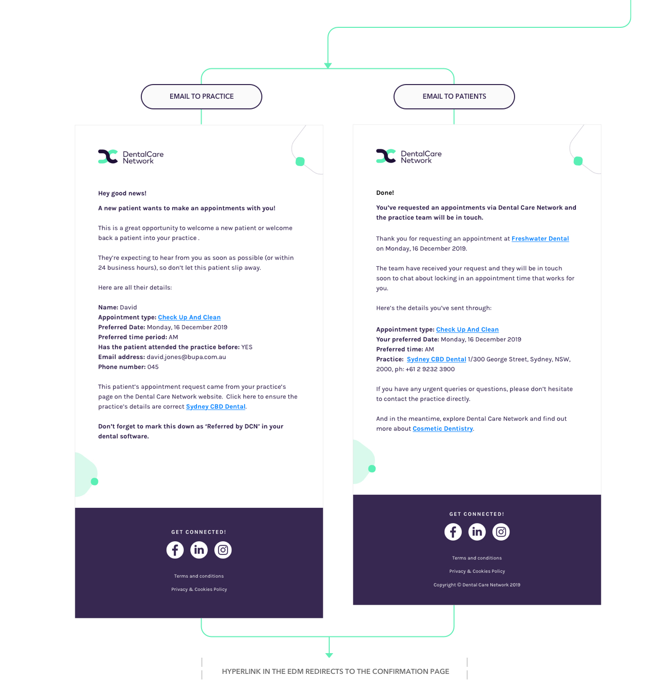
  • Email to patients
  • Email to practices
  • Move CTA buttons
  • Implement Captcha
  • Analytic

Expectation

  • Flawless user experience
  • Easy and clear navigation
  • Consistent and recognisable patterns
  • Keep it simple
  • Ensure end-to-end user journey meets the expectation from the patients and the dental practices
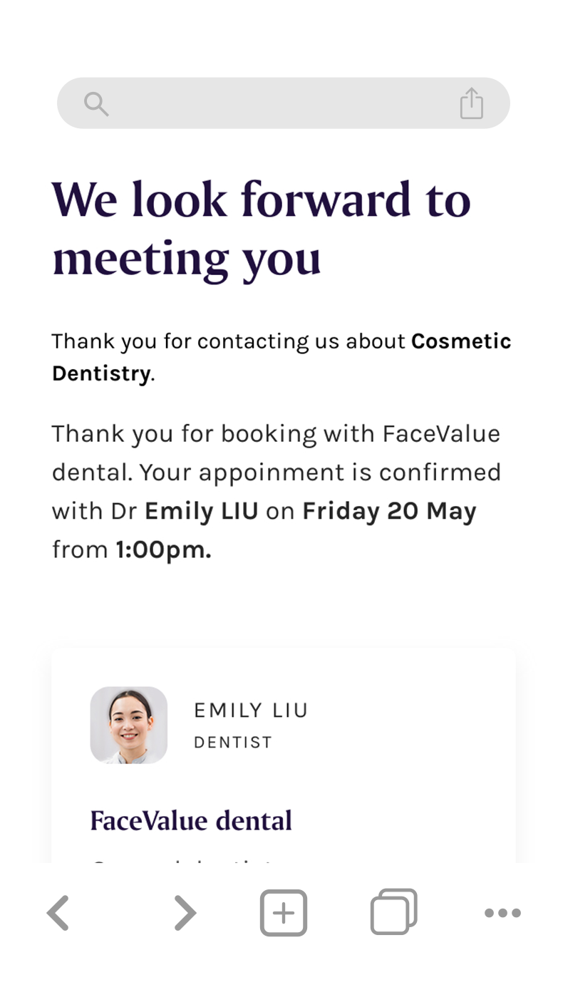
  • Confirmation page & a link to go back to the same page from patients email

Enhancing Access for Non-Integrated Dental Practices

Dental practices without an integrated booking system on their website can now be contacted directly by patients for appointments and general enquiries. This improvement encourages visitors to engage more efficiently with the DCN platform and explore available services.

Dental practice detail page - bottom section

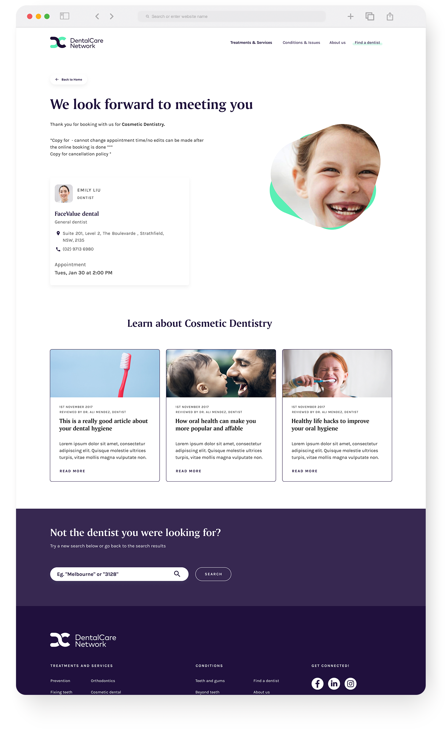
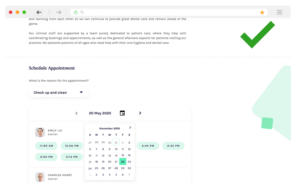
When a user clicks the “Request an Appointment” call-to-action, the page automatically scrolls to the appointment form section via an anchor link. This allows the user to immediately begin filling out their preferred appointment details, creating a smoother and more intuitive experience for contacting the dental practice.

User Interaction Map

DCN Online Booking System

Phase 2 - Booking System Integration

The DCN online booking system is designed to allow patients to easily schedule their own appointments directly through the website. It prioritises user-friendly functionality and performs effectively for both patients and dental practices.

Currently, DCN practices use a variety of different booking systems. This new booking engine will be rolled out across all practices, providing a single, unified platform that simplifies the process and offers a smoother, more consistent experience for patients.

Current Booking

Problems

Patients currently book through third-party websites that open in new windows. DCN aims to integrate booking directly into its platform for a smoother, more user-friendly experience.

Project Requirements

Limited Budget

Cost effective

Health services business had limited budget and time for it to be released online.

Delivery time

Time efficient

The project scope of delivery should be within 5-6 weeks including the testing

Intuitive

Smooth UX

My challenge is to brain storm the most cost effective, less complex but intuitive and flawless user experience.

Responsive layout

Desktop & Mobile

This site needs to be responsive so it is required to have both desktop and mobile design.

Design Specifications

During pre-refinement and discovery sessions with the squad team (Product Owner, Delivery Manager, Lead Front-End Developer, and Lead Back-End Developer), we collectively decided to exclude pagination and progress bar features from the booking flow. 

This decision was driven by a balance of user experience goals, technical feasibility, and project constraints -specifically, tight timelines and limited budget. By simplifying the flow, we ensured faster delivery while still maintaining a smooth and intuitive user experience.

Additional Requirements

DCN had to cater for patients who are young kids. Parents can make the appointments on their behalf. This UX journey will lead to a different booking form.
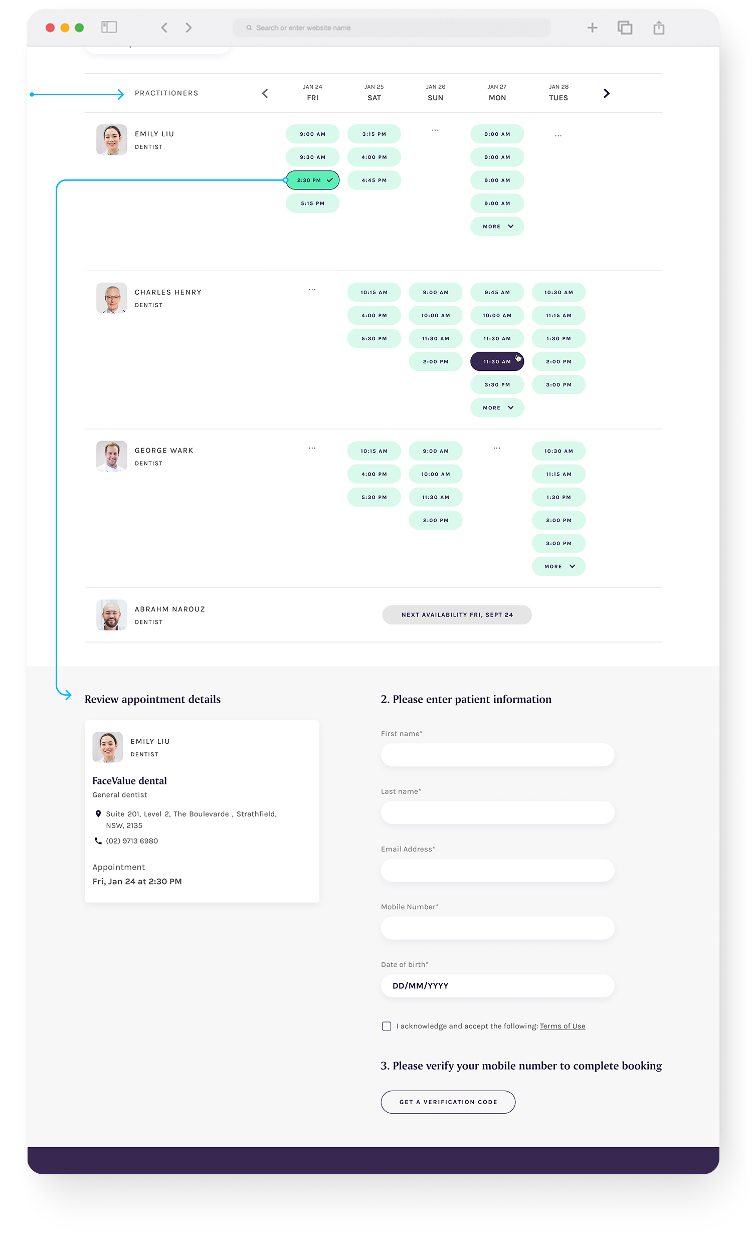
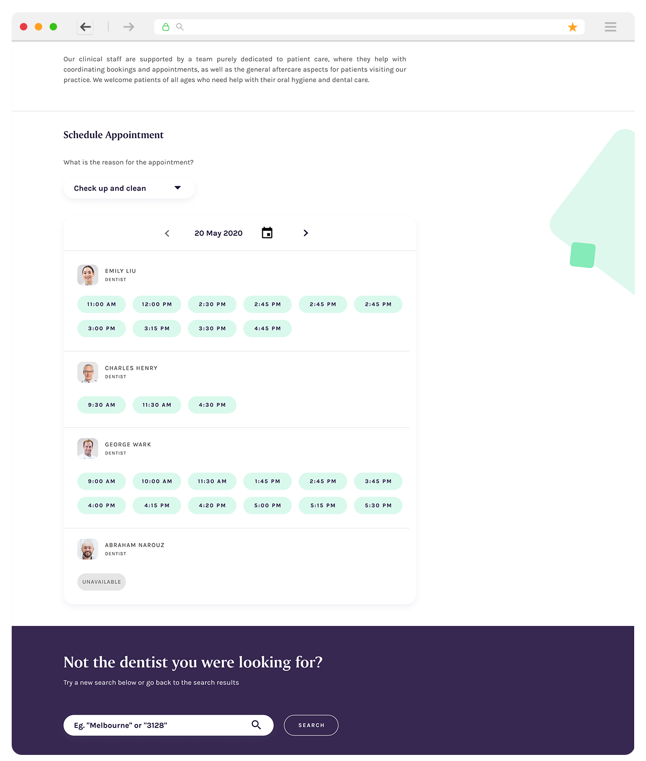
In each row, there are personal profiles of the dentists with the label. Users can click on the photo to go to the dentist’s profile page to explore more about the dentists which is under ‘About Us’ (selected clinic page)
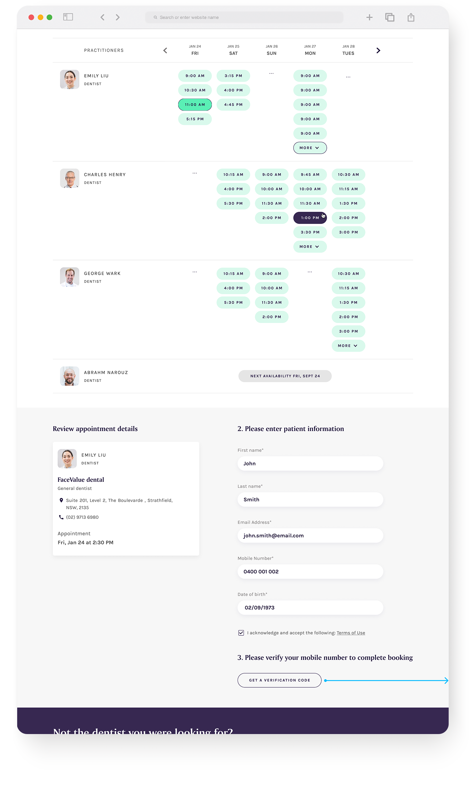
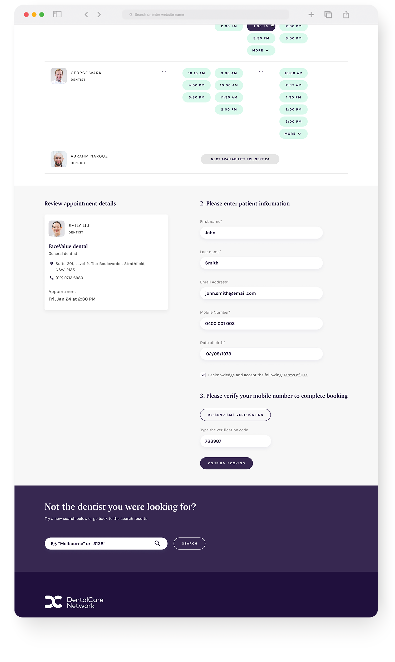
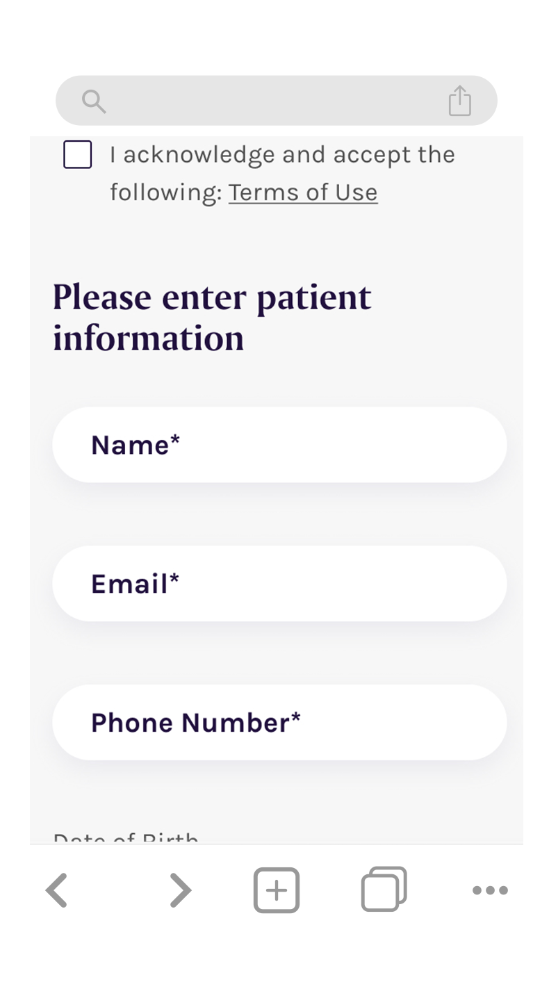
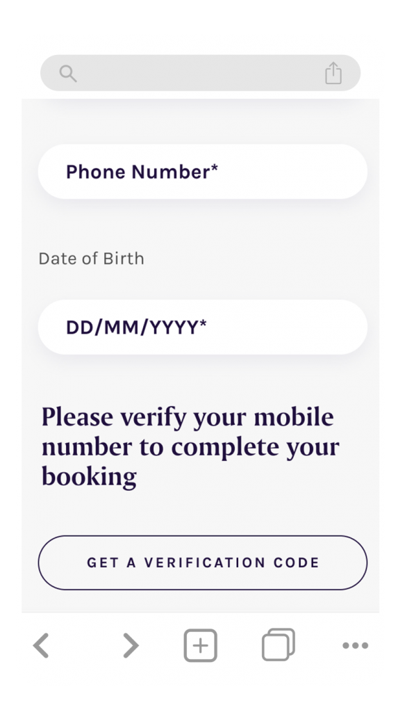
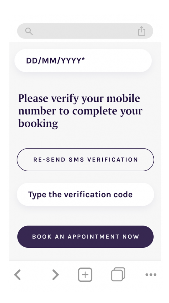
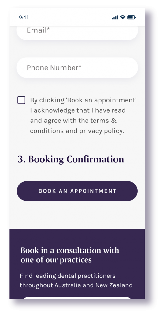
It is required to have the patient’s mobile number to verify and confirm the appointment.

Things to consider

Booking made through phone calls

Most patients prefer to book appointments by calling the practice. To support this, 60% of appointment slots are reserved for phone bookings, and 40% are made available through the online booking system. This setup shaped the UX approach, ensuring the online experience was clear, easy to use, and aligned with how the practice manages its schedule.
Desktop version vs Mobile version

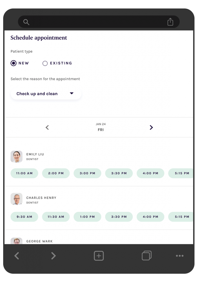
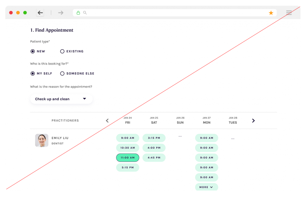
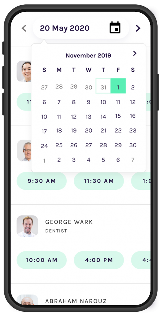
Desktop shows a weekly schedule of each dentist for their availability depending on the services they provide. Mobile version shows their daily schedules only so patients might have to click multiple times to find the availability for the future dates.
Challenges

Most online booking systems use pagination with back and forward buttons to guide users through the process. Without this functionality, creating an intuitive flow posed a significant UX challenge. To overcome this, I conducted a thorough competitive analysis – researching dental clinic websites across Australia, the UK, and the US to understand how others solved similar problems in booking interactions.

I collaborated closely with a Dental Specialist and the Digital Marketing Manager to validate the logic and structure of the booking mechanism, ensuring clinical accuracy and usability. Based on insights gathered, I proposed a one-page booking solution that simplified the experience while maintaining clarity and functionality. I also factored in PM feedback early on to ensure the design could be delivered efficiently within scope and budget constraints.

Solutions

UX Journey

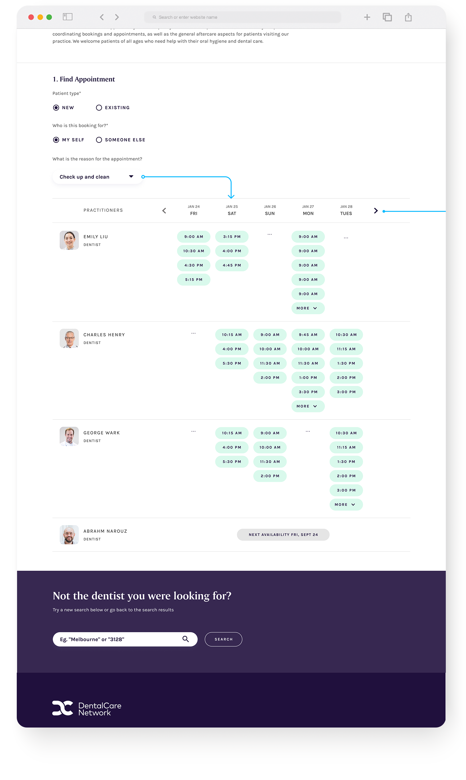
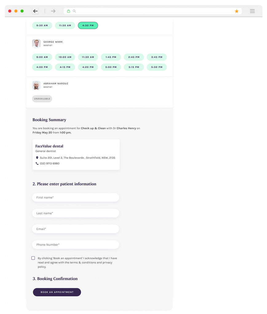
Interaction touch point should consist of 3 steps.
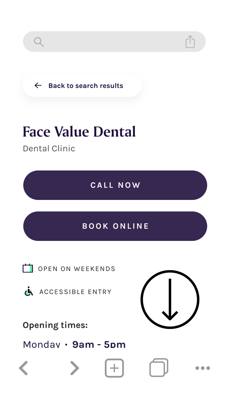
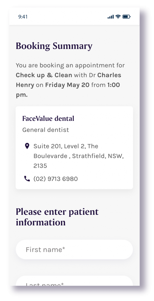
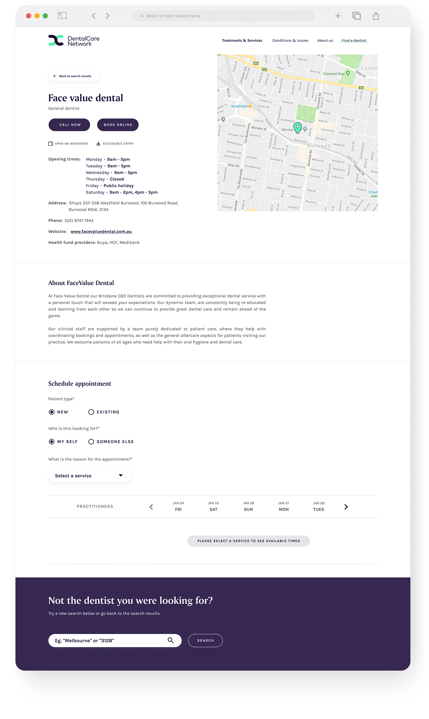
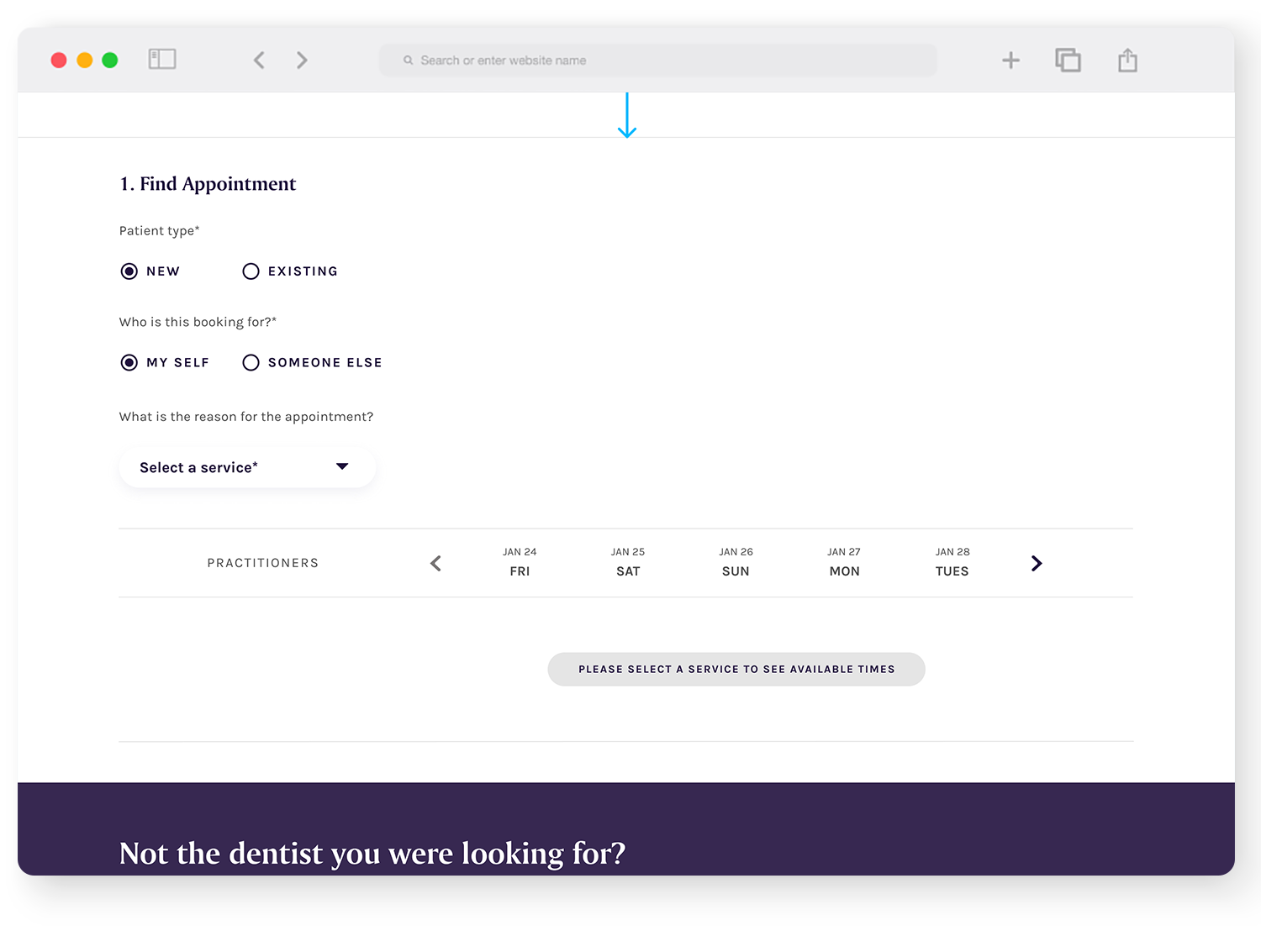
When patients land on the booking information page, book online will not open the external webpage but rather it will direct them to the bottom of the page.
Patients have no need to scroll down to the bottom of the pages since they click the button to explore the booking steps

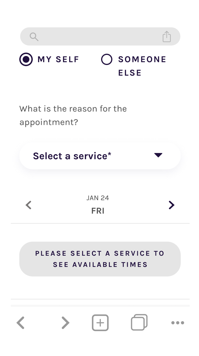
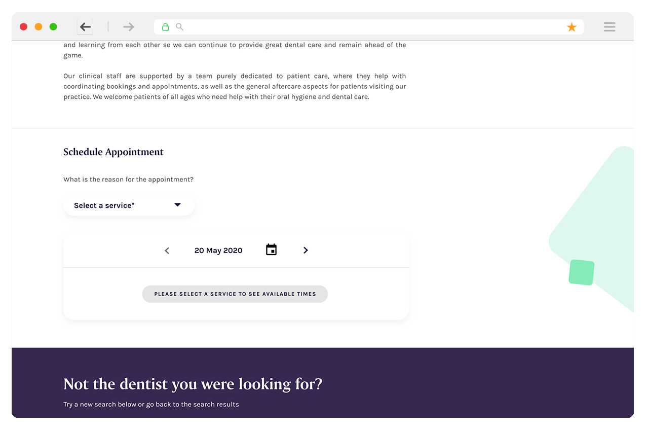
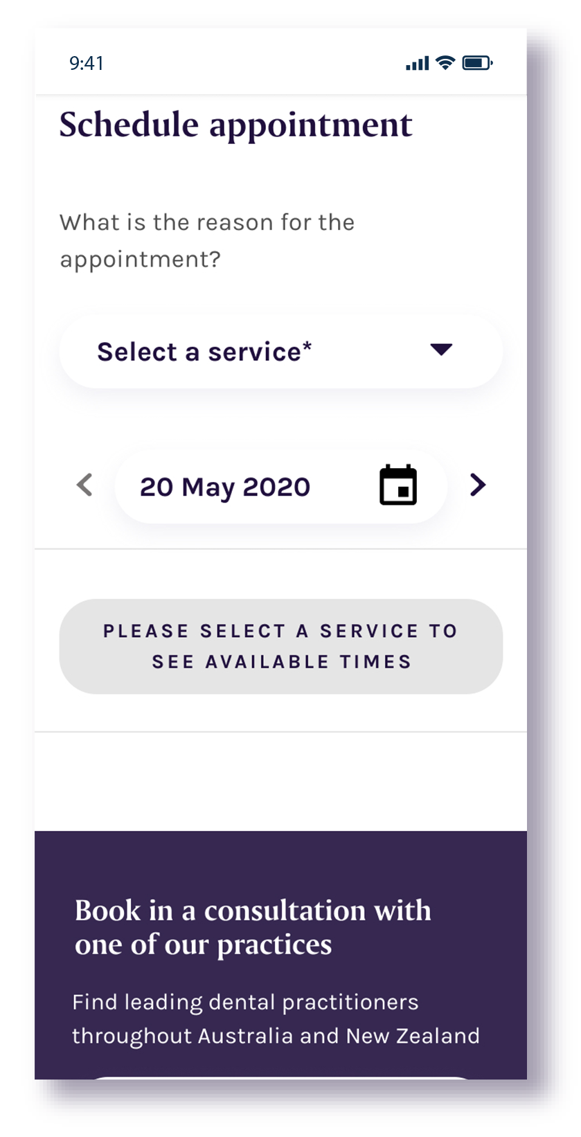
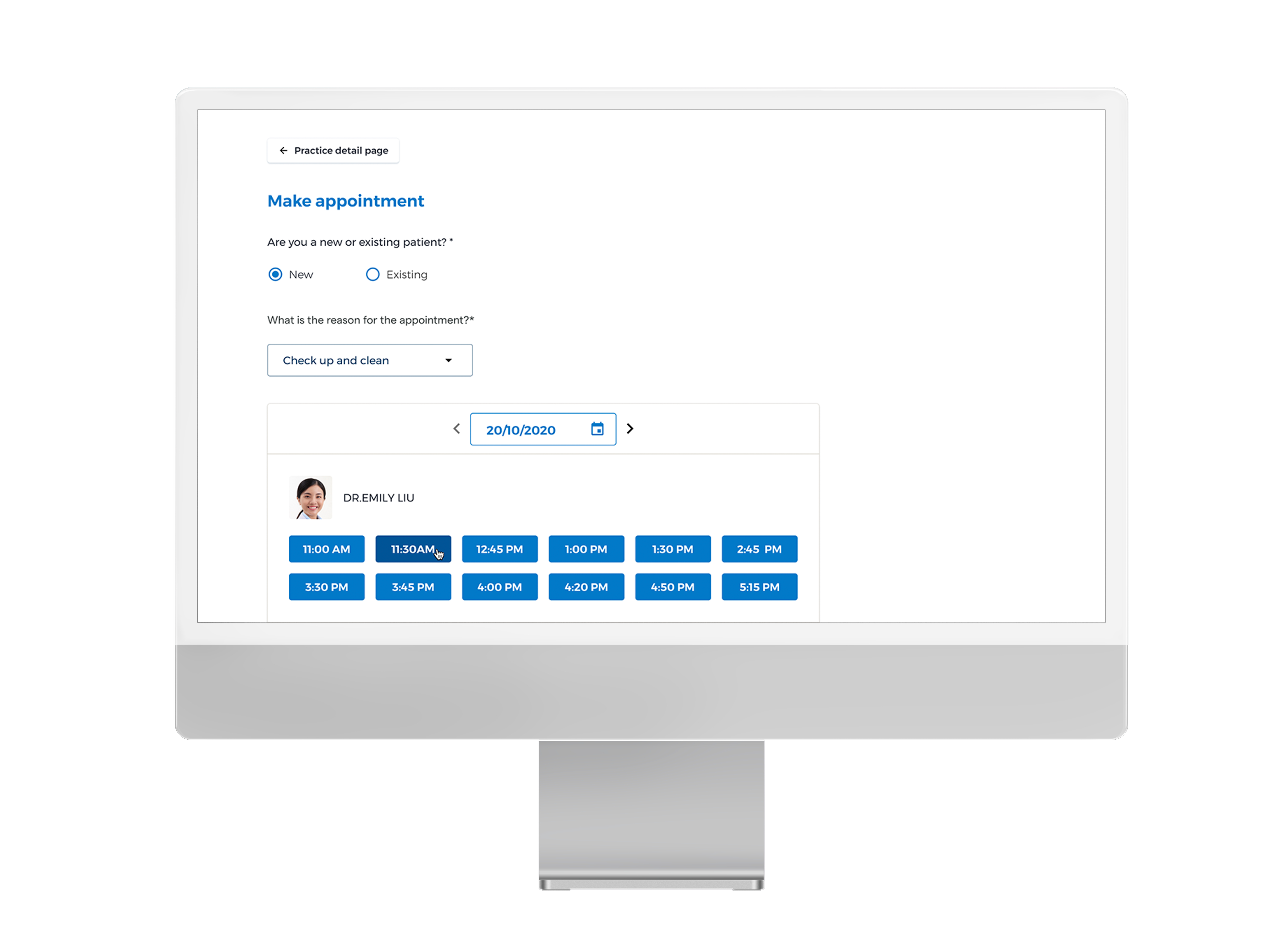
The default state for booking would appear as the empty schedule as the patients need to select the reason for booking to load the list of the practitioners.

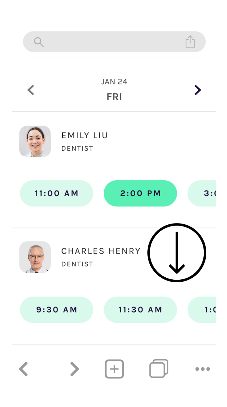
Once the patients choose the service then it will load the entire dentists’ schedules on a weekly basis and it allows them to freely choose the dentists who can provide the exact service at their preferable times.

Mobile Experiences

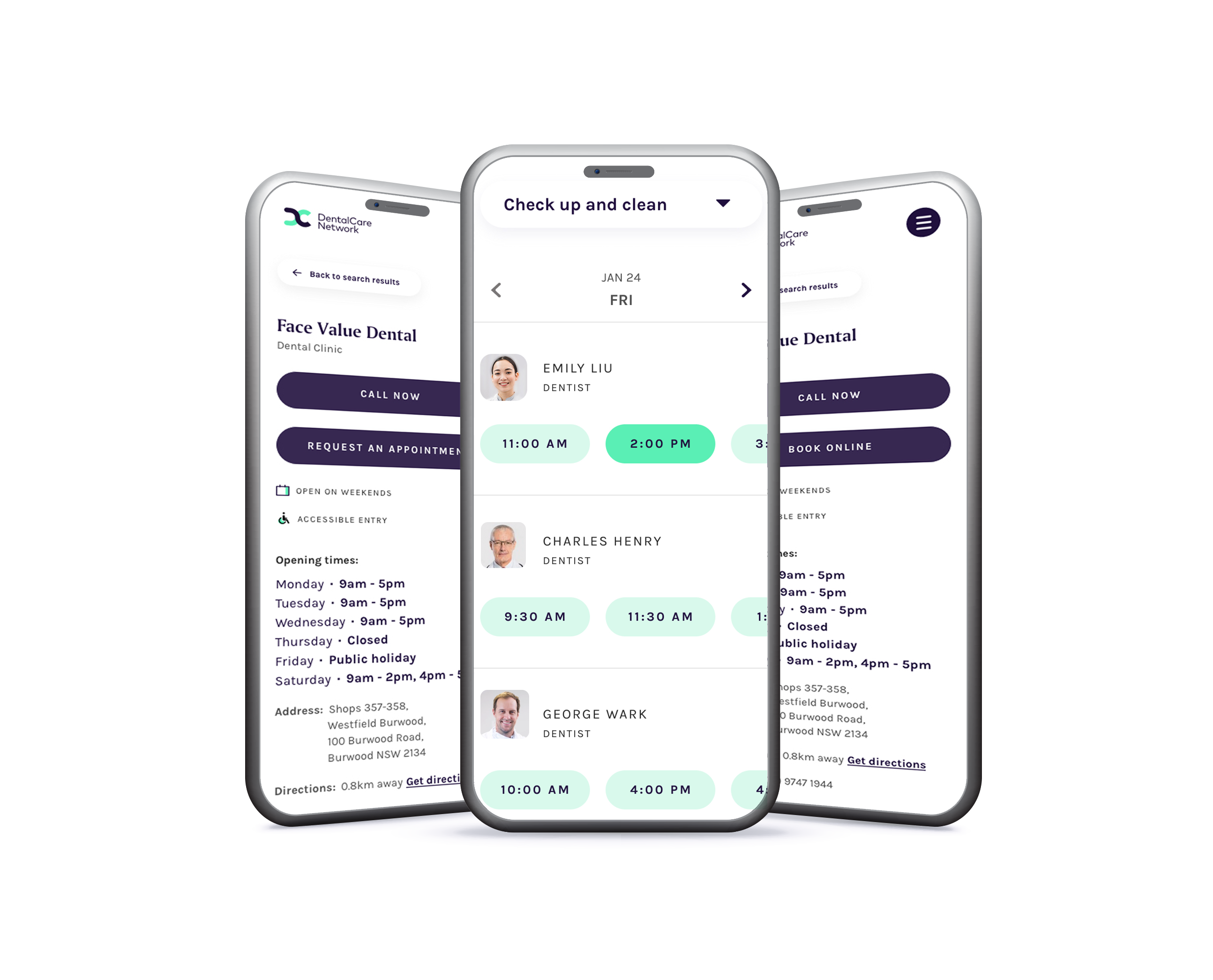
There are two ways to see and filter future dates by clicking the arrow to see the availabilities so the patients would need to click multiple times to go to the future date if it is for future booking (max 3 months ahead)

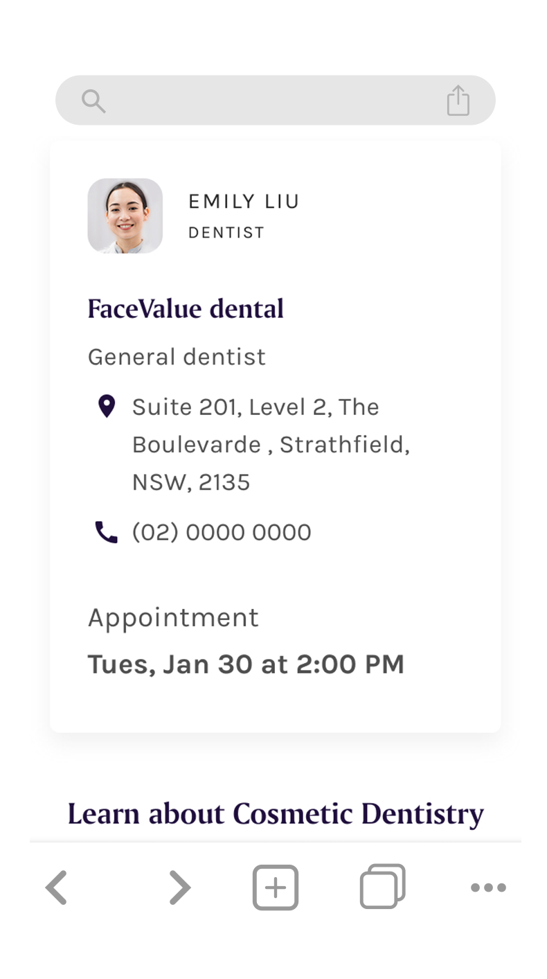
Or if the patients are after a particular dentist, they can simply click on the grey button to go to the week that he/she is available for a booking. After clicking book now button then it will go to the confirmation page.

Mobile Landing page

Select a Service

No schedule loads until patient selects main purpose of the visit
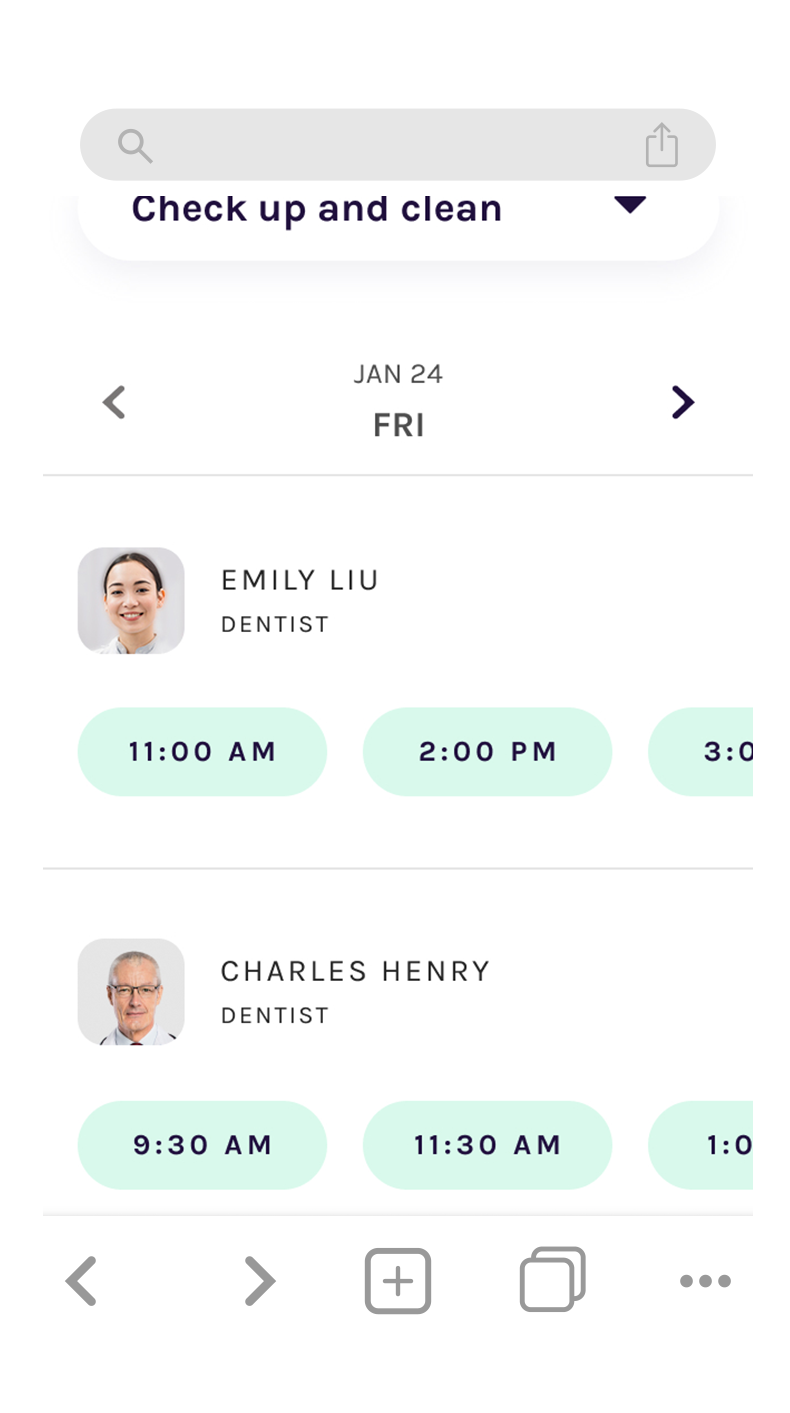
Schedule loads

Patient can scroll horizontally to make the appointment
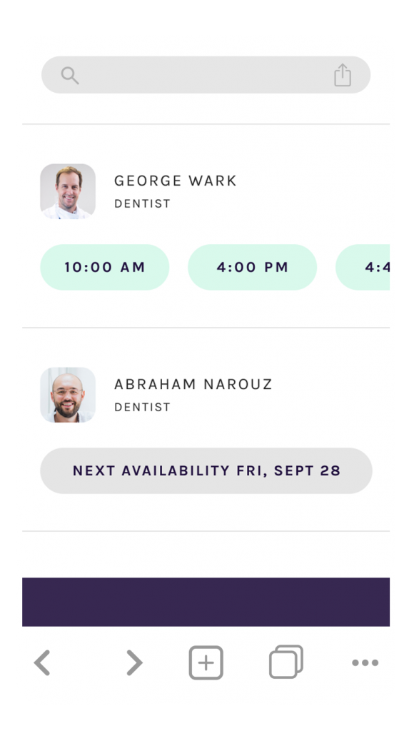
Tablet layout design (Vertical)
REVISED BOOKING DESIGN for DCN

Scope for the delivery

This piece of project was estimated by dev team for around 8 weeks worth of time to build.
The design and the functionality was favoured by the team and the stakeholders. However, the initiative for this project was dismissed and Health services business prioritised the other project for Clearly Dental to be launched first with the booking site.
During the COVID 2020, the project was de-scoped from 8 weeks to 2-3 weeks and due to the situation that was tough for the market, our squad had to delivery it in 2-3 weeks.

As a result, desktop site was replaced with the mobile design and many features needed to be dropped for the faster turnaround.
The same mobile design experience was expected to be applied on a desktop layout. We analysed the current solutions to be more simplified and flexible on a desktop and mobile without the sophisticated functions integrated with it for the time being.

Mobile Design

In the second phase of the scope development; We replaced “Request an appointment” functionality with “Booking” as we have now rolled out our internal booking system on the website. In the actual delivery, we de-scoped the profile picture due to complexity of pulling the database from the Salesforce and as it was difficult to maintain from the practice point of view. However, we successfully implemented the calendar on the mobile versions of the website which was built by the dev team for the second phase of the delivery. Patients can either use an arrow to find the appointment times for each day or use the calendar to select the suitable days to make a booking.

Bupa Dental Websites

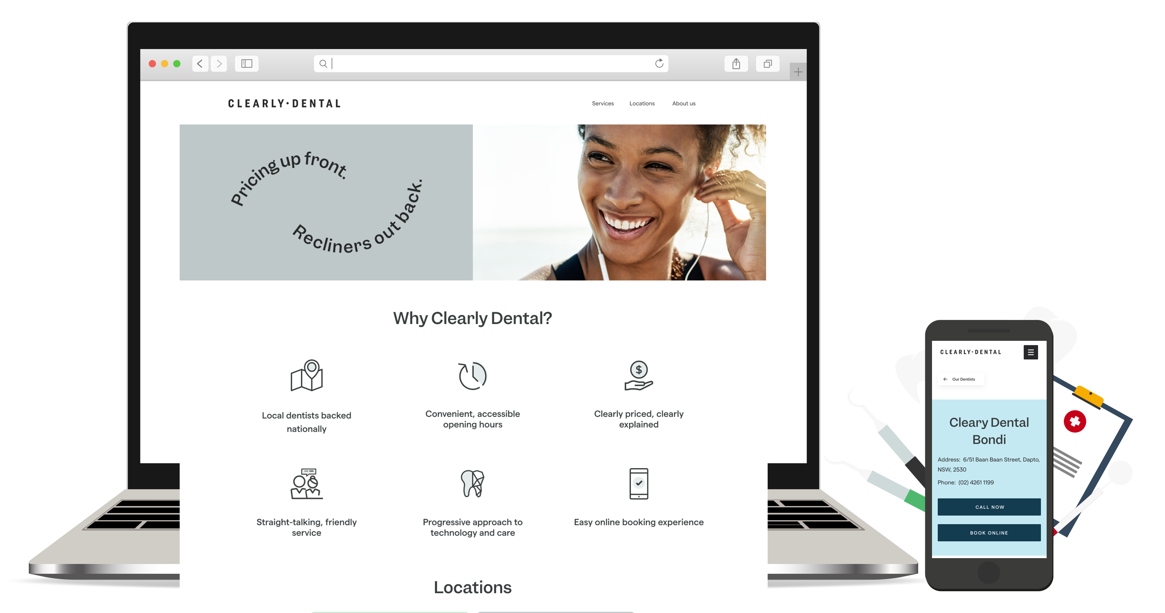
Designed and launched two branded family websites: one for Clearly Dental and one for Bupa Dental – each aligned with its distinct brand identity. The objective was to improve development efficiency and reduce costs by leveraging a shared, adaptable codebase across both platforms. Despite technical constraints, we delivered a scalable and cohesive solution that unified product and service offerings through consistent UX patterns. This initiative aimed to increase customer engagement, particularly in regional and suburban areas, while strengthening Bupa’s presence within local communities.

Optimising the Dental Booking Experience Post-MVP

Although we successfully delivered a functioning MVP of the new dental booking system under tight time and budget constraints, we recognised early on that the user experience could be significantly improved.

Following the launch, we monitored both qualitative and quantitative feedback over the first quarter including insights from call centre logs, NPS surveys, and Adobe Analytics  to identify usability issues

Key pain points included:

The MVP was intentionally launched with a lean feature set, knowing the UX could evolve. Based on early insights, I’ve initiated a redesign of the calendar to include weekly and monthly views  giving users clearer visibility of appointment options with less effort. The foundation was thoughtfully designed with scalability in mind, making future enhancements straightforward. Over time, this approach will significantly improve usability, with each new feature building on a well-considered and intuitive experience roadmap

© 2025 Cre8design. All Rights Reserved.

Back to top